Monday, 23 May 2016

Week 2 - Survey Results


Unit 8


12 people

Have you played any games that use 8-Bit Graphics?
Yes
11
No
1

It seems that most people that are in my age range do know what an 8Bit game is and have played some.

Could you name your favorite and Why?
- Super Mario Bros
- Undertale – Engaging story, unique battle system and amazing characters
- Pixelated piracy – Good Mechanics
- Zork – Amazing story
- Metroid Fusion – Amazing Story
- Legend of Zelda
- Pac Man – Addictive Gameplay
- Vampyre
- Gauntlet
- Bootleg Pokémon Games

This shows that people want to have an engaging story and unique gameplay, such as Undertale's unique take on a turn based combat system.

Did you like the design of the main/playable character?
Yes
11
No
1

Well I would hope you like the main character of a game you like... This would be because the main character needs to be enjoyable as you will be playing as them for most of the time you are playing the game.

Why?
- Fit with the world
- Simple
- Funny Appearance
- Appeals to the player
- Colourful
- Clear

It appears that people like a character who fits with the theme of the game, and is not too over-complicated. Some people also said that they like a colorful character, which would be easy as I already planned to have a colorful game.

What do you think is important in the design of an 8-Bit character?
- Realistic
- Making sure it is simple and not confusing
- The size and colours
- Have to fit with the world and theme
- Be original
- Be unique as people remember them
- Defining traits are visible and clear
- Not clustered

People like a character who is unique and original, this appears to be the most popular of opinions and I too believe these to be the most important as a bland character is boring to play as. Also people once again said that the character has to fit in with the world, this means that no differing art styles as well as a fitting design. As my game is in 8Bit making sure that any defining traits are clear would be very important, otherwise a lot of characters would look very similar.

Do you prefer a character who has a clear identity or one that’s left up to the player?
Clear identity
5
Up to the player
7

Out of the people that I asked, it was almost an even split, but it seems that people slightly prefer a character who's identity is up to the player...

Why?
- Gives a more personal experience to the character
- Allows me to relate to a character and feel more engaged
- More interesting
- Can put yourself in someone else’s shoes
- More developed
- Feel more involved with the character
- Can connect to the character much more
- Feel more in control
- It’s fun to make your own character
- It’s up to the player on how the character acts
- Have more freedom to role play

There were good reasons for both having a set character and having one that is up to the player. If I was to make a character with a set identity then I could put more detail and flesh them out more. It would also allow the player to see the world through the eyes of someone else.

If I use a character that the player can be in charge of then the player will feel like they have more control, which appeals to most people. Also it would allow them to put themselves into the game, allowing the game to appeal to the players need for escapism.

Which of these styles of sprites do you prefer?
Black Outline
7
Description: \\col-fs-001\users\kyeA4724\Downloads\Fox_1.gif
Coloured Outline
5

The majority of people seem to like the black outline more than coloured ones. This was close however, and I don't believe that picking the other one would impact the appeal of characters to a major extent...

Why?
- Stands out
- Adds depth
- Clearer
- Adds a clear edge to the character
- More visible
- Would fit into the world more
- The black outline is too clustered
- Clear and more professional

The main reason for liking a character with a black outline was due to it standing out more from the background, making it easier to see the character. It also adds a sense of depth, making the character not appear flat on the background.

People also believed that the black outline made the image too clustered and made the character not feel like part of the world. They also thought that the coloured one seems more professional than the black outlined one.


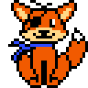
This has helped me in the design of not only my main character, but all the characters within my game. This was proving difficult as I was indecisive with how my characters would be, but from the information that I have gathered I can now progress with altering my main characters design.


I originally wanted to create a character that was fully fleshed out with a lot of detail, but this research has shown me that perhaps a design thats more simple would appeal to the audience more. It also helped as now I don't have to worry about all the detail and can create a character who simply fits the world and is distinctive from all the others...

Friday, 20 May 2016

Week 2 - Target Audiance


Unit 8

I wish to make my game appeal to older teens while keeping an appearance of a kids game. This will be achieved using darker themes with a colourful style. I also wish to make my game look like a game for old consoles such as the NES or Genesis. To achieve this I plan of giving my game a pixelated style that resembles that of games for these systems.

In order to find what people in my target audience want in a character I plan on creating a quick survey, which will aim to find out what people think makes an effective and enjoyable pixel character. Using the information that I collect I will be able to create characters that will appeal to them.

I will also look at the design of different characters and environments within games to see if it can influence my ideas and help me come up with new ones in order to make my game more entertaining.

Thursday, 19 May 2016

Week 7 - The Bad Guys

Unit 8

Using the app Piskel I created the sprites of three characters that will appear within my game. These will take the role as the opposition to the player, who will have to defeat all of them to progress. The characters I created include a Fox, Pig and Ball of Fluff.

To begin designing them I first started by making a basic sketch of what I wanted them to look like, as I would need a reference to draw from when making the pixelated version. 


(Concept Drawings)

I then set about drawing the outline of the character, making sure everything fit.


Next I used layers to build up the features, starting with the skin/fur colour and ending with the face. This kept everything neat and would make the animating steps easier, as I could edit layers when needed and not risk messing up the entire sprite.


The final step was one I did to try out a basic animation loop. This involved adding a few frames and changing the sprite to try to make it look alive. I did this by making eyes blink and body parts move.


The images came out perfectly how I wanted. They are clear and simple and use vibrant colours. I do believe that I need to practice the animation however as they did look a bit jittery and I will need to match the speeds up, or things could become complicated when applying to Game Maker.

Animated Sprite: http://piskel-imgstore-b.appspot.com/img/6375e3cc-232f-11e6-afdf-7be368b9bb4c.gif

While working on the characters I came across some issues that I will need to keep in mind while designing sprites, the biggest of which is how different the FPS can make an animation look. I had a problem where one animation required 26 frames, while another only needed 3. This would not work in a game where all animations need to run on the same FPS as some animations would look really jumpy, while others would look smooth. It could also cause some animations to de-sync which would not be good and could break the game. I will need to make sure that not only all the animations run at the same FPS but also flow the same, whether that be jumpy or smooth.

Hopefully I can use what I learned here to improve my main characters design. I should also begin to look into making some designs for the level the game will take place in...

Wednesday, 18 May 2016

Week 7 - New Program...


Unit 8

Piskel

Accessed on 5/18/2016: http://www.piskelapp.com/


Piskel is a simple web based tool for creating sprites and pixel art. The program requires no download and is free to use, so long as you have a stable internet connection you can access and use the program. This makes it easy to access from both home and college, so I would be able to work at college, then get home and pick up where I left off. Also it is linked to your google account so you can save any work you do online. This means that you don't need to rely on external storage and the work will always be available.

When you load the program up you will be greeted with a 32x32 pixel canvas. This can be re-sized by using the option on the side. There are options to keep the aspect ratio which will allow you to keep proportions the same and even one that will re-size the content, allowing you to up-size smaller works. You can also change the default size the program will load up in, which would be useful if you were making several sprites of the same size.


Changing the size

The program has several tools that you can use to create sprites with, but the main one is the pen tool. This allows you to colour pixels in one of four different sizes ranging from 1x1 to 4x4 pixels. You can create colour palettes that allow you to remember what colours a you used for sprites. This can be useful for several sprites that use the same colour palette.


A quick look at the few tools available

The program uses a layered system which allows you to make more complex sprites or you could make the different features on different layers, allowing you to delete of change one part without messing up another. There is also an onion skinning option which adds a transparant overlay of all the other layers. This is useful for making moving sprites where you need to know what the frame before looked like, and yes it does allow you to add frames so you can make an entire animated sprite.


A basic animation I made using frames


While I did plan to create all my sprites in Adobe Illustrator, the simplicity and usefulness of this program has convinced me to switch to using this. Not only that but also it will allow me to work at home, something that would not be possible if I used Illustrator as I do not have it on my computer.

Tuesday, 17 May 2016

Week 7 - Player Character Research

Unit 8


Undertale - Frisk


Who

This is the main character of the game Undertale, who goes by the name Frisk. They are a human that has fallen into a world of monsters and the player must guide them out. Depending on the choices the player makes, Frisk can be a gentle pacifist who wishes to make friends, or a child of evil who wants nothing more than genocide. This is one of the only characters in the game to not have a more detailed sprite, as you do not get to see them in a situation where the design would be necessary. This means the only design for this character are the overworld sprite and the cover art.

Points of Interests

  • Simple
  • Pixelated
  • Not Gendered
  • Not Realistic
  • Very Limited Colour Pallet

Analysis

The design for Frisk is very basic and simple. This would help with the animation as you only have a very basic design to animate. Also the character has no set gender, this shows heavily in the design as the character has almost no qualities that would indicate any one gender. Frisk also has no traits that would indicate any personality, this makes them a blank slate that is able to be molded into whatever the player wishes. This design choice fits with the fact that this is an RPG (Role Playing Game) heavily relying on choice.

The pixelated style simply comes from the art style of the game as a whole, this style of design gives the game its retro feel and also keeps design choices very basic as you don't need to add much detail to these sprites. Realism in design is not a problem with this design, as people don't expect realism in a retro styled pixelated game. This means that the connotations with the style heavily impacted the design choices, as the creator did not want to break the belief that the game could be from this retro style.

By using a very basic and limited colour pallet, the character can be easily identified by the colours that they wear. Each character has their own colour pallet and very few are shared, this helps identify and differentiate each character, making them seem like their own individual.


Legend of Zelda - Link


Who

Link is the main protagonist in most of the Legend of Zelda titles. While there are many variations of the character, I chose to focus on the original as it was made in retro style similar to Undertale. Link is a boy who was tasked with saving a princess from a demon king. Just like the character, the player is not given much information and is expected to make their own choices on how to proceed. This allows the player so put themselves into the characters shoes and feel more immersed and fit the genre of RPG.

Points of Interest

  • Very simple colour pallet
  • No outlines
  • Very little detail
  • Not many pixels

Analysis

Very similar to the design of Frisk in Undertale, Link has a very simple colour pallet that makes him recognizable. Unlike Undertale, Legend of Zelda was limited by the technology, this meant that design choices like this would have been heavily constrained by this. Something else that was likely done due to technology limitations was the lack of outlines.


Monday, 9 May 2016

Week 5 - State Machines Research


Unit 8


State Machines


Thursday 5th May 2016: The Game Maker's Companion, Jacob Habgood


What is a State Machine?

"State machines provide a way of breaking down large programming tasks into smaller chunks so that you can consider them more easily."


It seems that a State Machine Is a page of code that makes your game work. It can also be referred to by other pieces, this can greatly simplify the coding process if done right and allow you to do more complex actions within the game. It also helps tell the game what should be happening when a specific state is started, for example if the character enters a falling state then he will fall down, but if he then hits a platform he will enter the standing state and stop.

How does it work?

The aim of a State Machine is to make things within the game change states, this will cause different things to happen based on what state the object enters.

Here is a diagram of a state machine for a game that the book is using as an example:


This diagram gives a clear representation about the different states for the character and how they enter each one, as we can see if the player is in the standing state and presses the space bar then the character will enter the jumping function. Once the animation ends then it will hen enter the falling state until it hits the ground, at which point it will return to the standing state.


How would it be useful to my project?

The point of a state machine, is to have a sort of engine that can control apects of the game using minimal amounts of code. This will also allow easy troubleshooting if something were to go wrong.

Will I use it?

If I find that time is on my side, then I will defiantly like to look into creating one for my game, as It would be a good thing to learn for any future projects.